Blue Home Decor
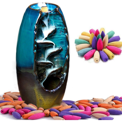
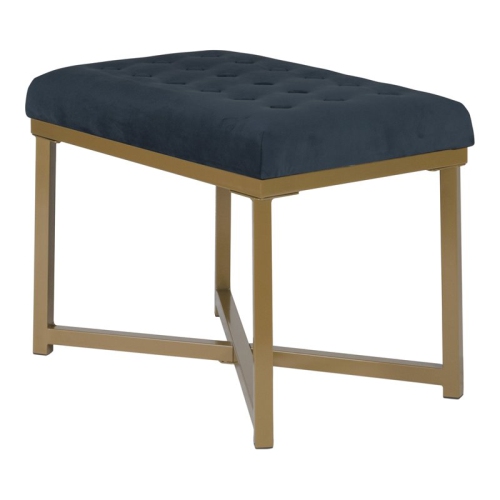
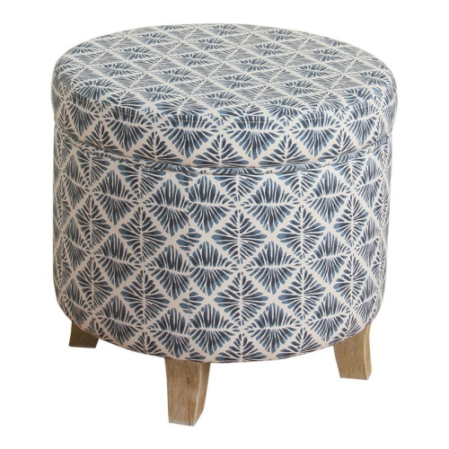
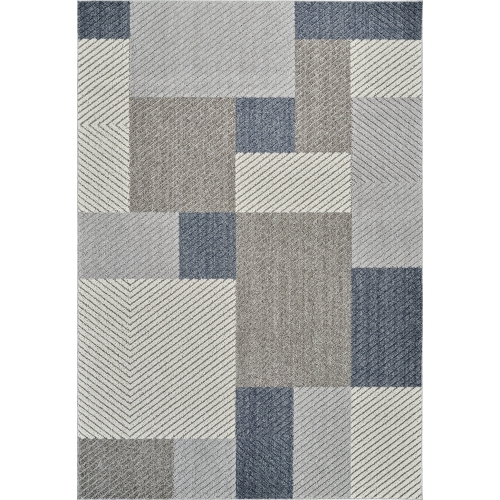
Transform your living space into a serene oasis with these blue home decorations. From soothing coastal hues to vibrant cobalt accents, this curated selection offers an array of stylish options to elevate the ambiance of almost any room. Whether you're looking to refresh your bedroom, add a pop of color to your living area, or create a calming atmosphere in your bathroom, these blue home decorations have everything you need to infuse your home with tranquility and style. Discover an assortment of decorative pillows, curtains, rugs, wall art, and more in various shades of blue that will effortlessly complement your existing decor.
Sort

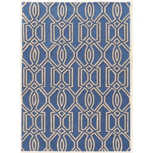
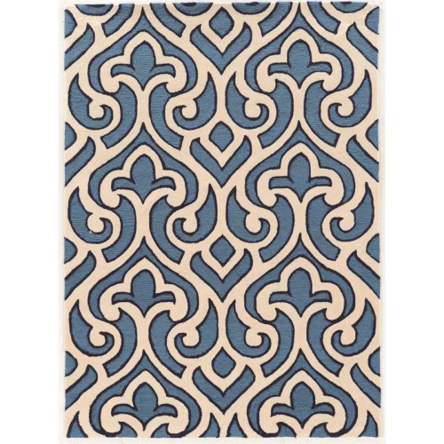
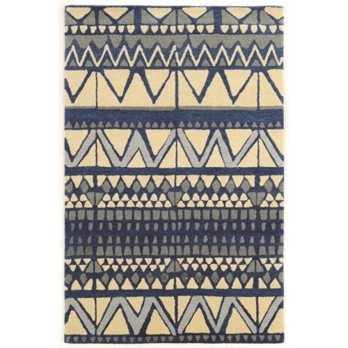
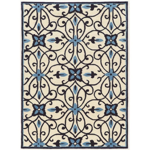
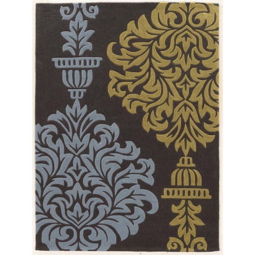
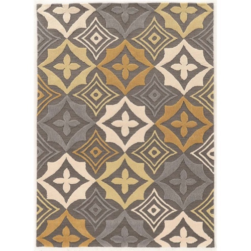
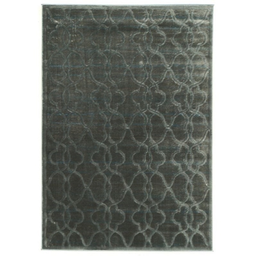
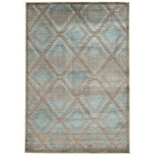
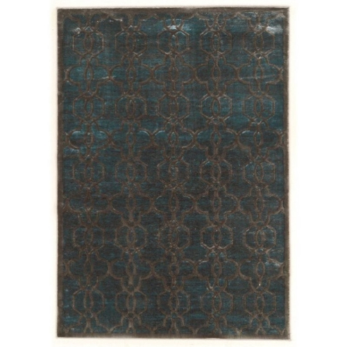
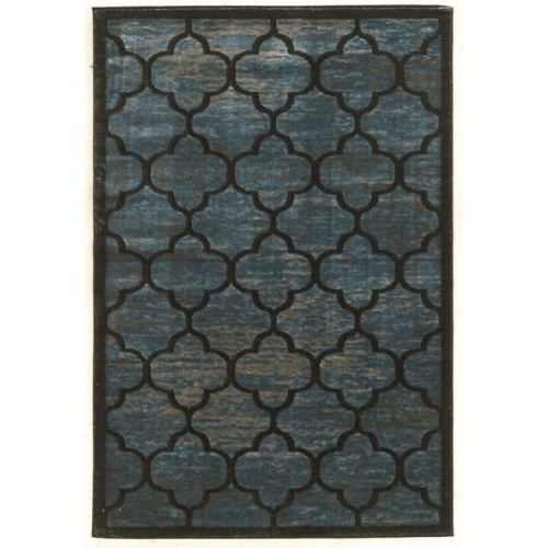
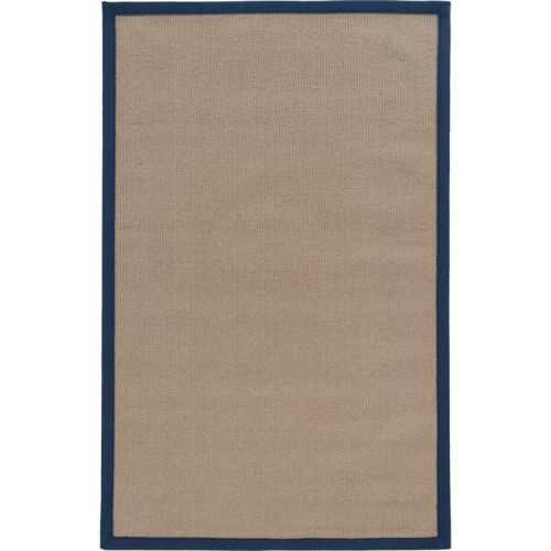
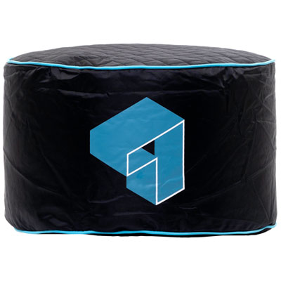
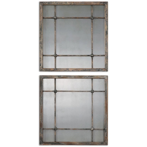
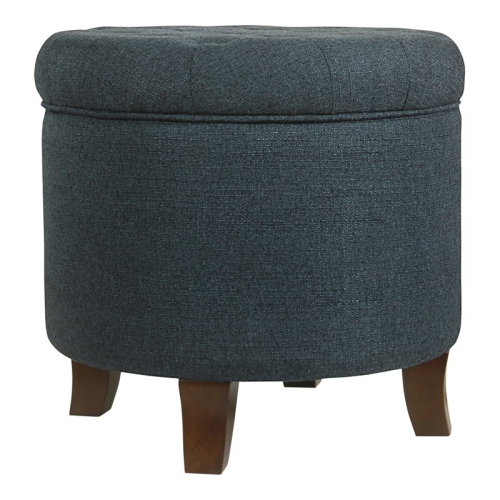
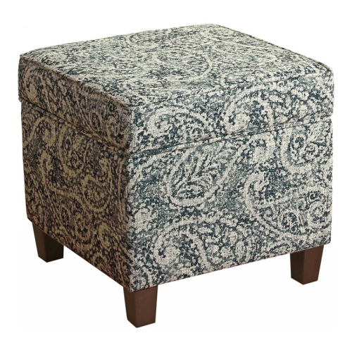
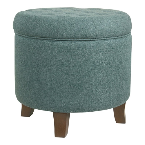
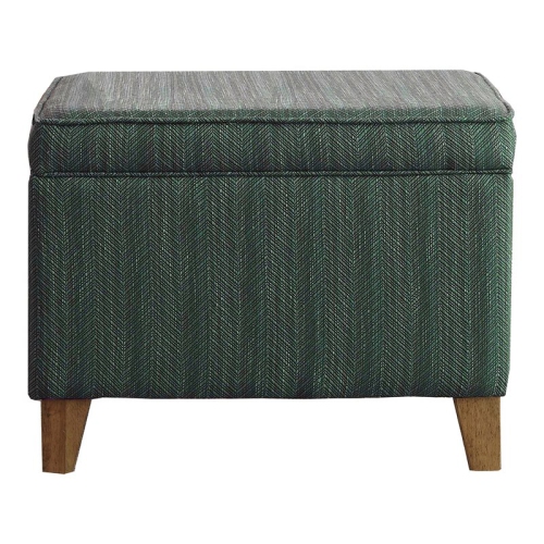
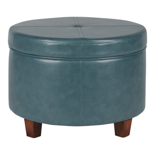
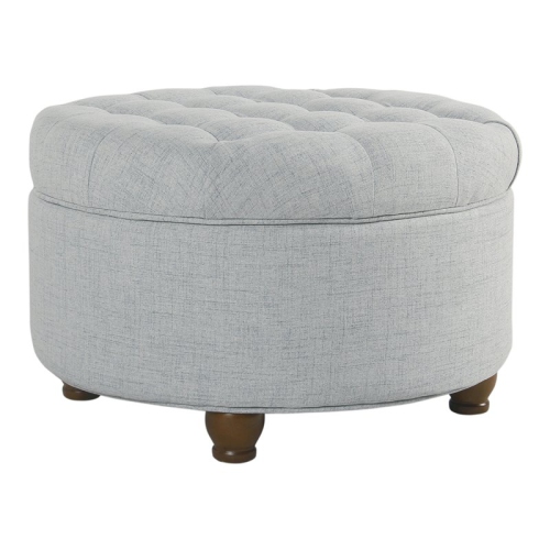
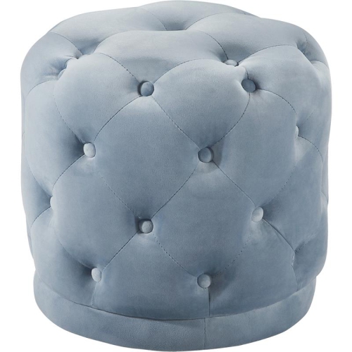
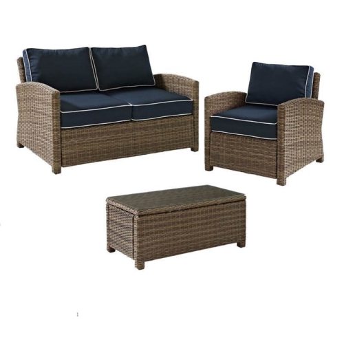

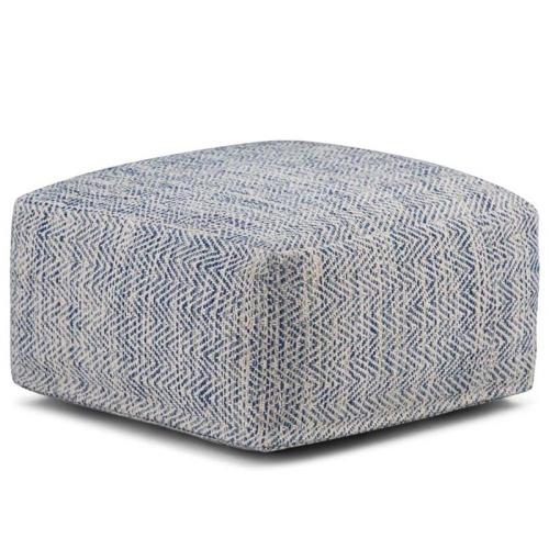


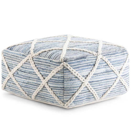
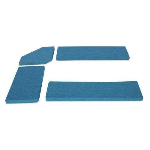

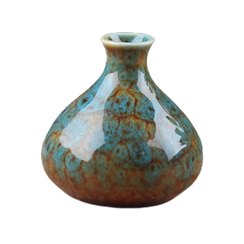
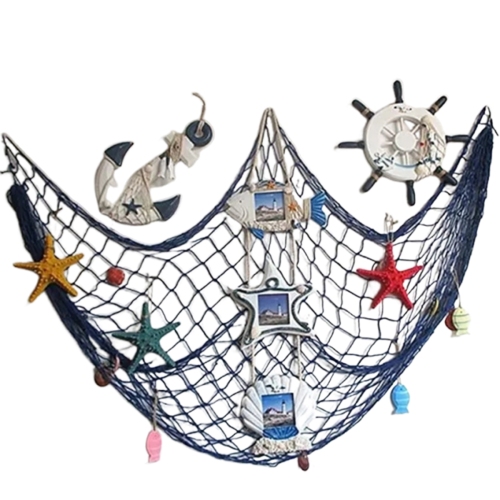
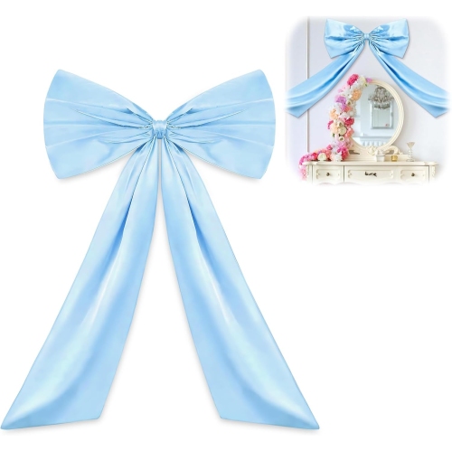
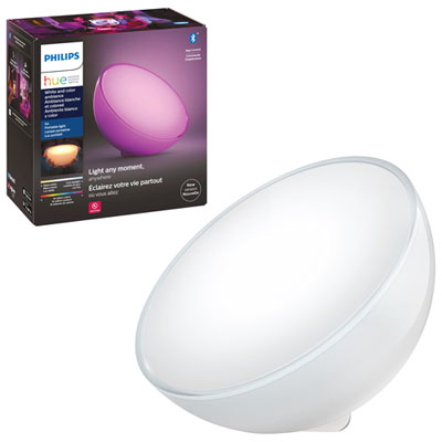
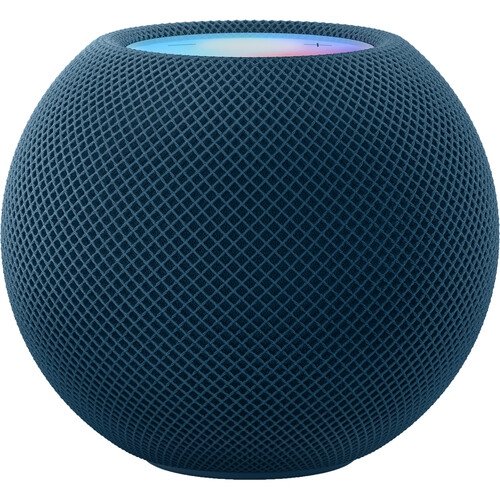
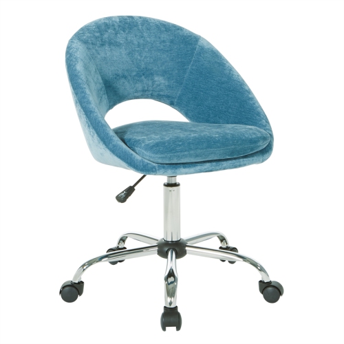
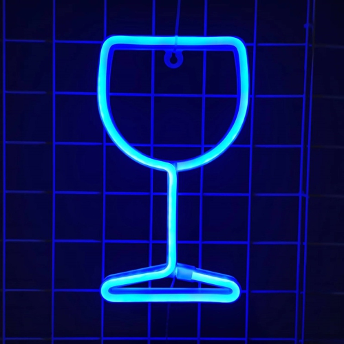

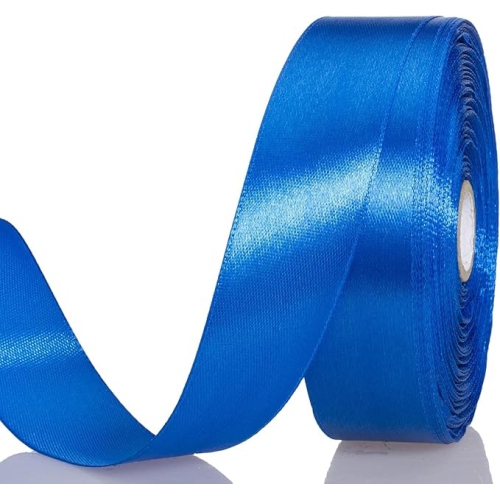
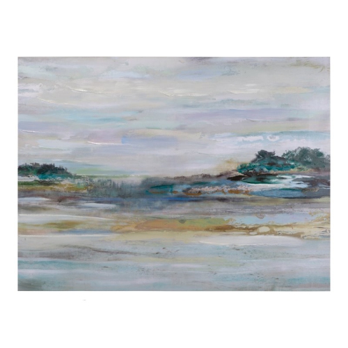
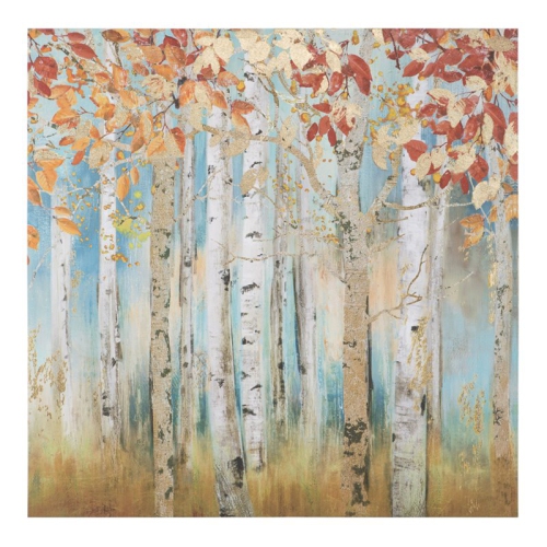
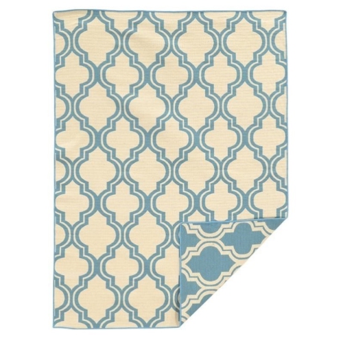
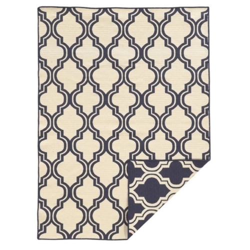
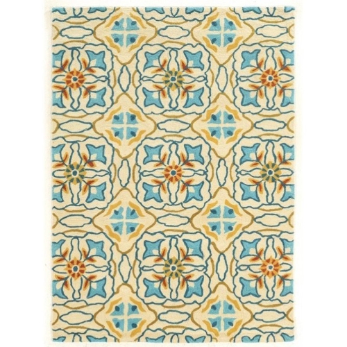
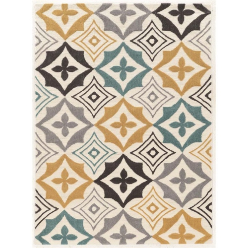
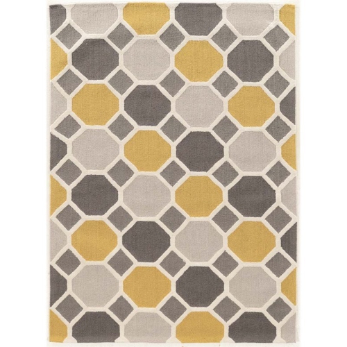
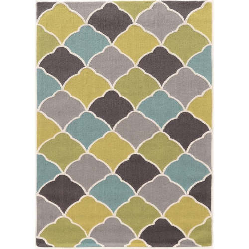
How different shades of blue work with your furnishings
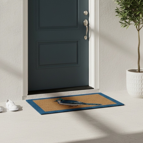
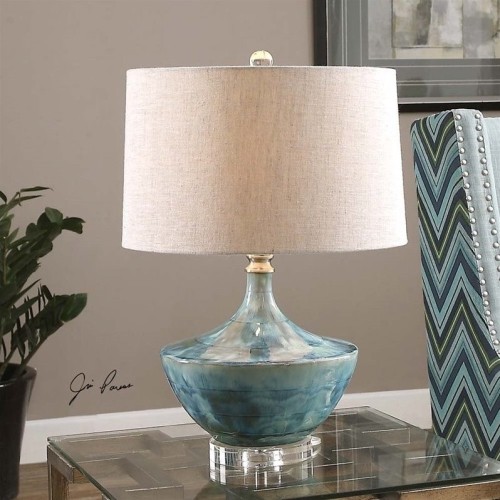
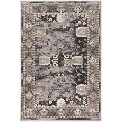
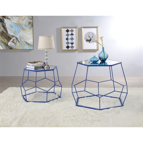
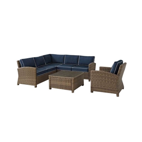
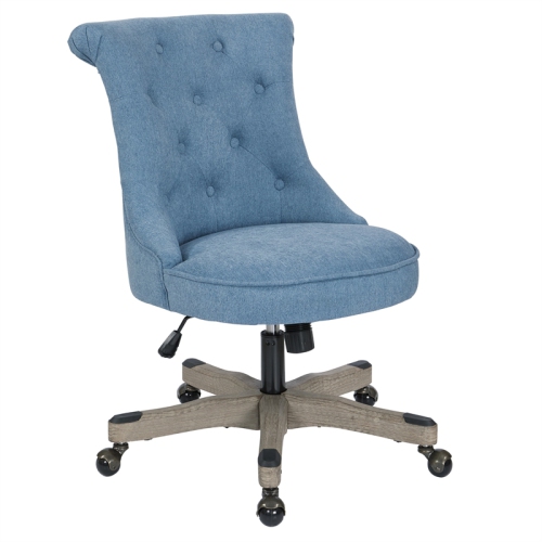
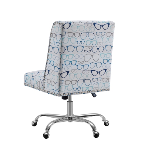
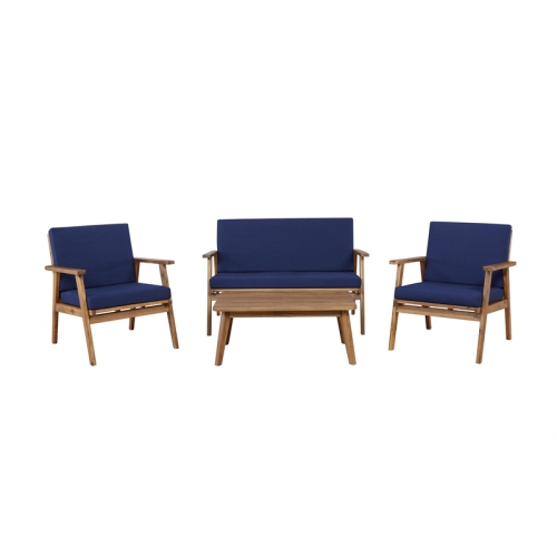
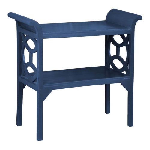
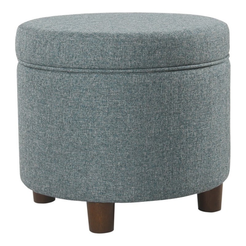
Blue home décor brings colour, contrast, and a sense of continuity to living rooms, bedrooms, dining areas, and smaller spaces such as entryways. Its range is part of its appeal: pale sky blue can feel light and airy, dusty blue has a softer, more muted character, and navy creates a rich backdrop for lighter fabrics and warm wood finishes. Teal leans towards green, while cornflower and cobalt offer clearer, brighter colour. These differences matter when bringing blue accents into an existing room. A grey-blue fabric may blend comfortably with charcoal seating, while a warmer teal can sit naturally beside honey-toned oak or tan leather. White and blue form a crisp, familiar pairing; cream, beige, and brown soften the contrast for a more relaxed look. Blue also works with stronger colours. Ochre and rust bring warmth, green creates a gentle transition between cool shades, and red adds a lively contrast that suits everything from traditional patterns to playful contemporary spaces. For rooms that need a warmer counterpoint, red home décor can complement blue through small, deliberate accents rather than an equal split of both colours. The effect depends as much on placement and proportion as on the shade itself. A broad area of deep blue gives a room a different character from a few blue details scattered against neutral surfaces. Repeating a similar tone at different heights helps the colour feel connected without making every piece match. Lighting changes the picture, too: daylight can reveal green or violet undertones, while warm lamplight may make some blues appear softer or more subdued. In a room with limited natural light, pale blue paired with creamy textiles and warm finishes can feel less stark than blue against brilliant white. During the cooler months, deeper tones and layered textures bring visual warmth without requiring a complete change of colour scheme. That flexibility makes blue useful in both established interiors and homes whose furnishings have come together gradually.
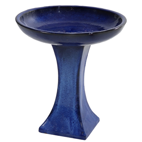
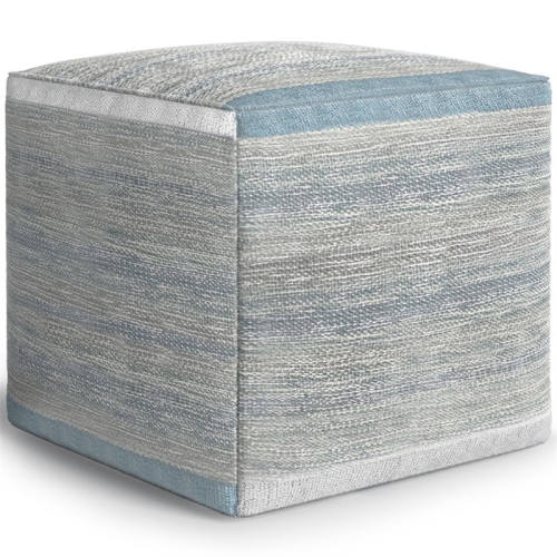
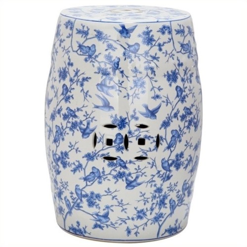
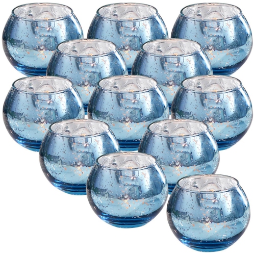
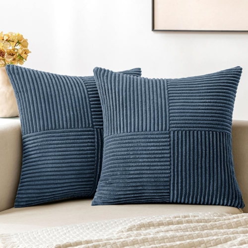
Materials give blue home accents much of their personality, influencing how the colour looks, feels, and holds up to everyday use. Linen and cotton often have a relaxed, matte appearance, with woven texture that keeps a solid shade from looking flat. Velvet reflects light differently across its pile, so the same blue can appear bright from one angle and almost inky from another. Wool adds a soft, textured presence, while synthetic fibres can offer practical benefits depending on their construction and care requirements. Fibre content alone does not determine durability; weave density, backing, stitching, and the intended use all contribute. For households with children or pets, washable textiles, secure seams, and finishes suited to frequent handling can make daily upkeep easier. Removable covers are helpful where spills are likely, although the care label remains the best reference for washing temperature, drying, and stain treatment. A fabric described as spot-clean only needs different care from one that can go through a washing machine. Hard materials create another set of effects. Glossy glazed ceramic gives blue a reflective finish, coloured glass can catch light on a shelf or near a window, and matte surfaces offer a quieter look. Glass and ceramic can chip or break if knocked, making stable placement particularly important in busy rooms. Painted wood and coated metal bring colour to more structured forms, but their suitability for damp spaces or outdoor use depends on the stated finish and construction. In bathrooms and kitchens, moisture resistance and surfaces that can be wiped clean are more useful than appearance alone. Prolonged direct sunlight may fade some fabrics and finishes, especially where one side receives more exposure than the other. Regular dusting, gentle cleaning with suitable products, and prompt attention to spills help preserve the appearance of blue accents. Dark solid colours may show pale lint or pet hair, whereas some patterns and textured weaves make small marks less noticeable. These practical differences are especially relevant in family rooms, shared homes, and frequently used seating areas, where decorative pieces need to suit real routines.
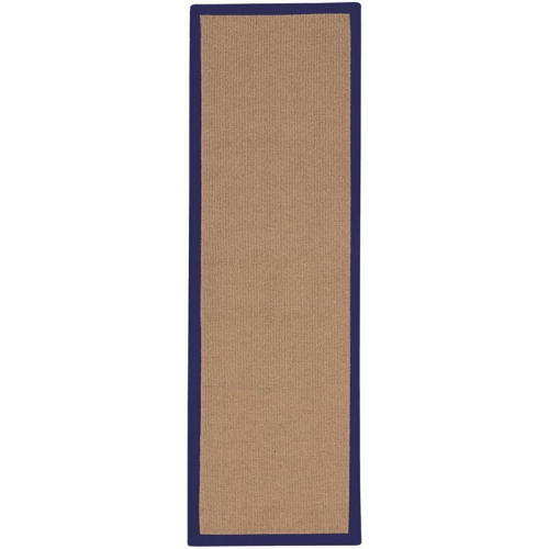
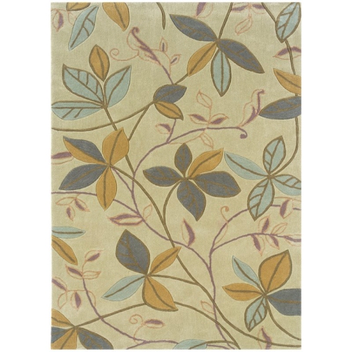
Scale and intended use help blue décor feel at home rather than simply added to a room. In a compact apartment, a few well-proportioned accents can introduce colour while leaving useful surfaces clear. A larger living area can accommodate broader patterns and more substantial forms without the details getting lost among seating and storage. Dimensions matter beyond whether something fits: a floor covering needs suitable clearance beneath nearby doors, window textiles need the right width and length for their intended coverage, and tabletop accents should leave space for everyday activities. Low-pile constructions may be practical where chairs move frequently, while a compatible non-slip underlay can help keep a rug steady on a suitable floor. Window coverings also have a functional role. Sheer fabrics filter light but offer limited privacy, particularly after dark when indoor lights are on; lined or blackout constructions provide different levels of coverage according to their specifications. In bedrooms, softer blues and tactile fabrics can support a restful-looking setting, while bolder geometric patterns bring definition to a home office or dining space. Pattern scale changes the balance: small repeats read as texture from a distance, whereas wide stripes and oversized motifs become more prominent features. Mixing solid blue with one or two related patterns can create variety without crowding the room visually. Shared spaces often benefit from this flexibility, since blue can connect different tastes through a common colour rather than an identical style. It works with clean-lined furniture, traditional wood pieces, coastal textures, and more colourful arrangements, depending on the surrounding materials. Blue accents can also make thoughtful housewarming or wedding gifts when the recipient’s preferences and living space are known. Smaller, easy-to-place pieces generally require less commitment than large furnishings, while washable fabrics and straightforward care can be welcome in a busy household. Whether the setting is a first apartment, a family home, or a guest room, the most useful blue décor balances colour and texture with comfortable proportions, manageable upkeep, and a clear place in everyday life.
Materials give blue home accents much of their personality, influencing how the colour looks, feels, and holds up to everyday use. Linen and cotton often have a relaxed, matte appearance, with woven texture that keeps a solid shade from looking flat. Velvet reflects light differently across its pile, so the same blue can appear bright from one angle and almost inky from another. Wool adds a soft, textured presence, while synthetic fibres can offer practical benefits depending on their construction and care requirements. Fibre content alone does not determine durability; weave density, backing, stitching, and the intended use all contribute. For households with children or pets, washable textiles, secure seams, and finishes suited to frequent handling can make daily upkeep easier. Removable covers are helpful where spills are likely, although the care label remains the best reference for washing temperature, drying, and stain treatment. A fabric described as spot-clean only needs different care from one that can go through a washing machine. Hard materials create another set of effects. Glossy glazed ceramic gives blue a reflective finish, coloured glass can catch light on a shelf or near a window, and matte surfaces offer a quieter look. Glass and ceramic can chip or break if knocked, making stable placement particularly important in busy rooms. Painted wood and coated metal bring colour to more structured forms, but their suitability for damp spaces or outdoor use depends on the stated finish and construction. In bathrooms and kitchens, moisture resistance and surfaces that can be wiped clean are more useful than appearance alone. Prolonged direct sunlight may fade some fabrics and finishes, especially where one side receives more exposure than the other. Regular dusting, gentle cleaning with suitable products, and prompt attention to spills help preserve the appearance of blue accents. Dark solid colours may show pale lint or pet hair, whereas some patterns and textured weaves make small marks less noticeable. These practical differences are especially relevant in family rooms, shared homes, and frequently used seating areas, where decorative pieces need to suit real routines.
Scale and intended use help blue décor feel at home rather than simply added to a room. In a compact apartment, a few well-proportioned accents can introduce colour while leaving useful surfaces clear. A larger living area can accommodate broader patterns and more substantial forms without the details getting lost among seating and storage. Dimensions matter beyond whether something fits: a floor covering needs suitable clearance beneath nearby doors, window textiles need the right width and length for their intended coverage, and tabletop accents should leave space for everyday activities. Low-pile constructions may be practical where chairs move frequently, while a compatible non-slip underlay can help keep a rug steady on a suitable floor. Window coverings also have a functional role. Sheer fabrics filter light but offer limited privacy, particularly after dark when indoor lights are on; lined or blackout constructions provide different levels of coverage according to their specifications. In bedrooms, softer blues and tactile fabrics can support a restful-looking setting, while bolder geometric patterns bring definition to a home office or dining space. Pattern scale changes the balance: small repeats read as texture from a distance, whereas wide stripes and oversized motifs become more prominent features. Mixing solid blue with one or two related patterns can create variety without crowding the room visually. Shared spaces often benefit from this flexibility, since blue can connect different tastes through a common colour rather than an identical style. It works with clean-lined furniture, traditional wood pieces, coastal textures, and more colourful arrangements, depending on the surrounding materials. Blue accents can also make thoughtful housewarming or wedding gifts when the recipient’s preferences and living space are known. Smaller, easy-to-place pieces generally require less commitment than large furnishings, while washable fabrics and straightforward care can be welcome in a busy household. Whether the setting is a first apartment, a family home, or a guest room, the most useful blue décor balances colour and texture with comfortable proportions, manageable upkeep, and a clear place in everyday life.
Top selling and popular products
-
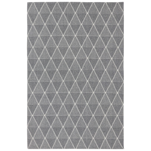 Your price for this item is $130.55
 -
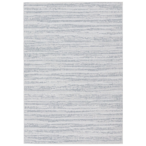 Your price for this item is $129.15
 -
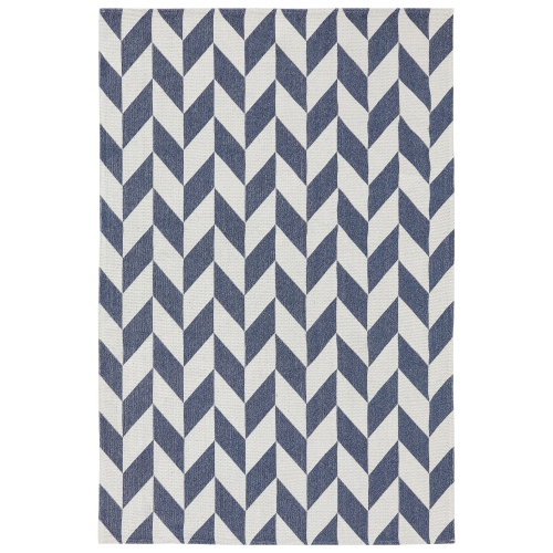 Your price for this item is $130.55
 -
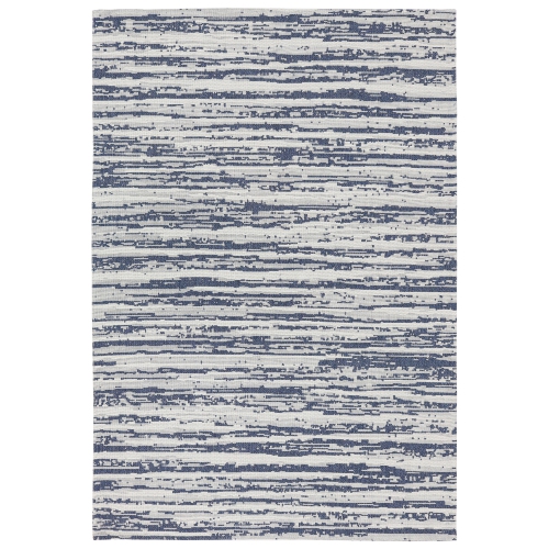 Your price for this item is $130.55
 -
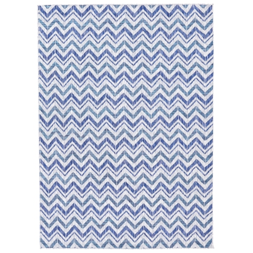 Your price for this item is $129.15
 -
 Your price for this item is $129.15
 -
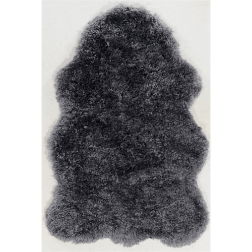 Your price for this item is $269.46
 -
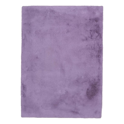 Your price for this item is $219.8
Discover more categories related to Blue Home Decor
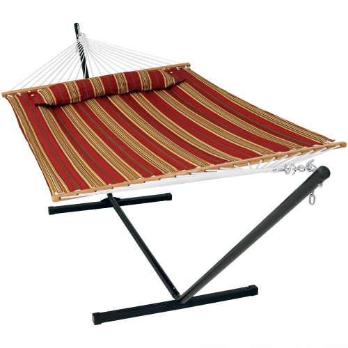
Top Collections:
Pokemon Centers, Kindle Devices, Best Budget Office Chairs, Apple iPhones 16, Best Laptops for Writers, iPhone 15 Apple, Canon G7X Cameras, Refurbished Apple Laptops, Alarm Clock, Motorola Razr Phones
Some products may be subject to Environmental Handling Fees
(EHF) depending on your province.
Learn more about EHFs.