Printmaking Papers
Looking to explore your creativity through the art of printmaking? Look no further than our wide selection of printmaking papers. These high-quality papers are specially designed to meet the unique demands of printmaking techniques, ensuring that your artistic vision comes to life with every stroke. Whether you're a beginner or an experienced printmaker, our collection offers a variety of weights, textures, and finishes to suit your preferences and artistic style. Discover the perfect printmaking paper for your next masterpiece and let your imagination run wild.
Sort



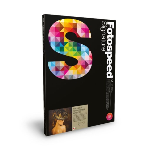
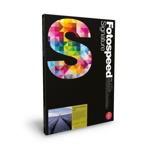
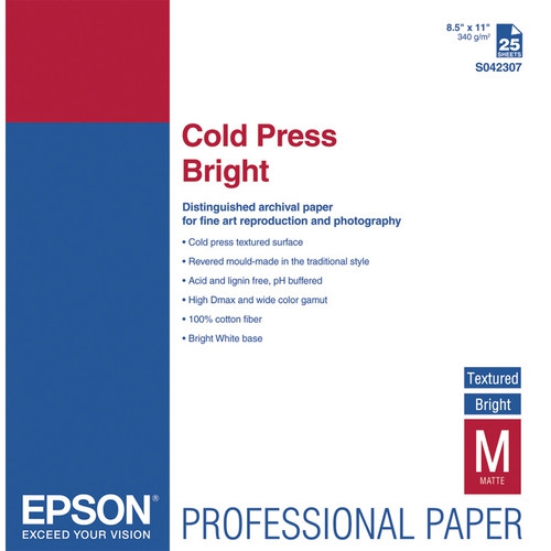
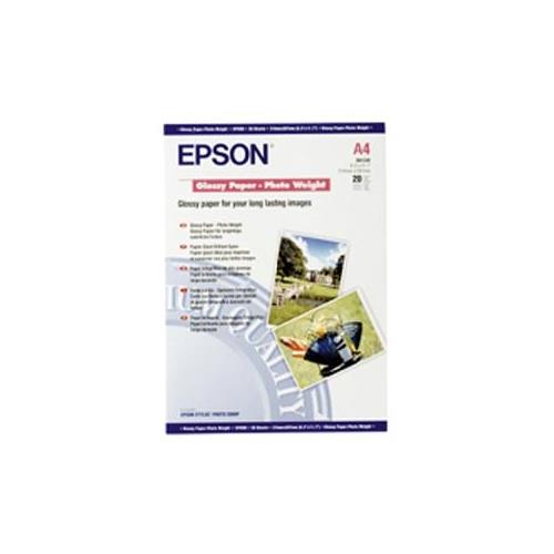
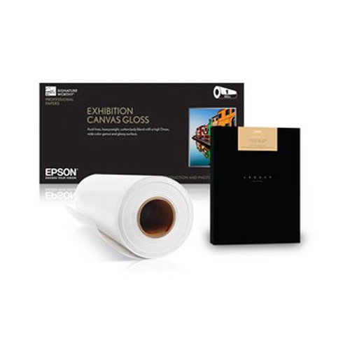
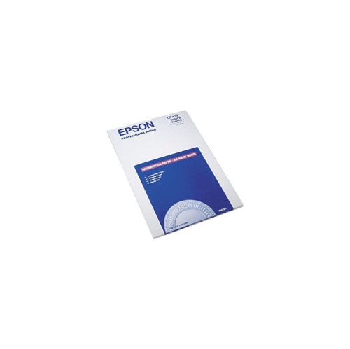
How paper shapes ink transfer and finished prints
Printmaking papers are designed to receive ink from a block, plate, stone, or screen, with the paper itself contributing to the character of the finished image. A crisp black linocut, a softly shaded etching, and a layered screen print place different demands on a sheet, so fibre content, surface texture, absorbency, and weight all matter. Unlike ordinary office paper, papers made for printmaking are selected for qualities such as strength under pressure, reliable ink transfer, and the ability to withstand the moisture involved in certain processes. Cotton papers are valued for their flexibility and strength, particularly when damp, while high-alpha cellulose papers can also provide a durable foundation for finished artwork. Fibre content alone does not establish long-term performance; acid-free and lignin-free specifications are useful considerations for work intended for framing, gifting, or keeping in a portfolio. Paper weight is usually expressed in grams per square metre, or gsm, which describes mass rather than thickness. Sheets around 200–300 gsm are common choices for many press-based applications, while papers under 100 gsm can work particularly well for hand-burnished relief prints. These ranges are starting points rather than fixed rules: a thin sheet made with strong, long fibres can perform quite differently from a thicker sheet with a softer structure. The surface matters just as much. A smooth finish supports fine lines, small lettering, and closely spaced marks, whereas a more pronounced texture may lend visible character to broad shapes and open areas. White, warm white, and cream papers also change the appearance of an image. Bright white can heighten the contrast of black ink, while a warmer sheet may soften the overall impression of muted colours. For artists moving between printing, drawing, and other media, Fine Art Papers offer a broader context for understanding how different surfaces contribute to finished work. Within printmaking, the most suitable paper is the one whose handling and appearance suit the technique and the intended result.
Relief printing, including linocut and woodcut, transfers ink from the raised portions of a carved surface. When printing by hand with a baren or spoon, a lightweight, flexible sheet can make it easier to achieve contact across the block without excessive pressure. Long-fibred Japanese papers are often used for this purpose, although their thickness, sizing, and absorbency vary considerably. A delicate-looking sheet may have impressive tensile strength, but it still needs careful handling when lifted from an inked block. Heavier papers can also produce satisfying relief prints, particularly with a press or a setup that provides even pressure. Intaglio methods, such as etching and drypoint, place different demands on paper because the sheet must reach into recessed marks to pick up ink. Supple papers that retain strength when damp are well suited to this process, and a substantial sheet can carry the indentation of the plate as part of the finished presentation. Dampening requirements depend on the particular paper and printing method; not every printmaking sheet benefits from soaking. For screen printing, dimensional stability becomes especially important when separate colours must line up accurately across several passes. A sheet that changes shape with moisture can make those edges harder to align, and each layer needs suitable drying time before further handling. Lithography generally benefits from a surface that accepts fine tonal detail and consistent ink coverage, while monotypes can range from sharp, graphic impressions to loose, painterly passages. Across these techniques, sizing—the treatment that controls how readily paper absorbs liquid—affects the way ink sits on or enters the surface. Too much absorption for a particular ink may soften edges, while insufficient contact or an unsuitable finish can leave patchy coverage. A small proof on the intended paper can reveal details that a weight or fibre description cannot: whether a fine carved line stays open, whether a solid area prints evenly, and whether the sheet releases cleanly. Compatibility with water-based or oil-based ink is best assessed alongside the paper maker’s stated applications, rather than assumed from appearance alone.
Sheet size, format, and handling characteristics influence how comfortably printmaking paper fits into a workspace. Full sheets allow flexibility for larger compositions or several smaller prints, while cut sheets and pads offer a consistent format for repeated studies and compact projects. The dimensions need to accommodate both the image and its margins, with room for handling, registration marks where needed, and a signature beneath the print. A generous border can frame a small image beautifully, but it also requires a sheet that fits the press bed, drying area, and storage space. Deckled edges give some papers an irregular outline that suits float mounting, while straight-cut edges create a tidy boundary for editions, portfolios, and folded work. Neither edge style establishes quality on its own. For a print that will be folded into a card or artist’s book, grain direction and flexibility can matter as much as surface finish; thick or heavily printed sheets may need testing to avoid cracking along a fold. Consistency is particularly valuable when making an edition, where matching paper colour, texture, and dimensions helps the prints feel related. Care begins before the first impression. Clean, dry hands help prevent marks that may interfere with ink transfer, and flat storage protects corners from curling or crushing. Papers are best kept away from direct sunlight, damp conditions, and abrupt humidity changes. Fresh prints need adequate drying space, and sheets should not be stacked while ink remains liable to transfer or stick. Once dry, protective folders and suitable mounting materials help preserve the surface during storage and display. These practical qualities make printmaking papers useful to students learning pressure and registration, hobbyists carving blocks at a kitchen table, and experienced artists producing carefully matched editions. They can also make a thoughtful gift for someone who already enjoys printmaking, especially when the paper matches that person’s usual technique and working size. From quick proofs that capture an idea to finished impressions intended for a wall, the paper is both a working material and a visible part of the artwork.
Relief printing, including linocut and woodcut, transfers ink from the raised portions of a carved surface. When printing by hand with a baren or spoon, a lightweight, flexible sheet can make it easier to achieve contact across the block without excessive pressure. Long-fibred Japanese papers are often used for this purpose, although their thickness, sizing, and absorbency vary considerably. A delicate-looking sheet may have impressive tensile strength, but it still needs careful handling when lifted from an inked block. Heavier papers can also produce satisfying relief prints, particularly with a press or a setup that provides even pressure. Intaglio methods, such as etching and drypoint, place different demands on paper because the sheet must reach into recessed marks to pick up ink. Supple papers that retain strength when damp are well suited to this process, and a substantial sheet can carry the indentation of the plate as part of the finished presentation. Dampening requirements depend on the particular paper and printing method; not every printmaking sheet benefits from soaking. For screen printing, dimensional stability becomes especially important when separate colours must line up accurately across several passes. A sheet that changes shape with moisture can make those edges harder to align, and each layer needs suitable drying time before further handling. Lithography generally benefits from a surface that accepts fine tonal detail and consistent ink coverage, while monotypes can range from sharp, graphic impressions to loose, painterly passages. Across these techniques, sizing—the treatment that controls how readily paper absorbs liquid—affects the way ink sits on or enters the surface. Too much absorption for a particular ink may soften edges, while insufficient contact or an unsuitable finish can leave patchy coverage. A small proof on the intended paper can reveal details that a weight or fibre description cannot: whether a fine carved line stays open, whether a solid area prints evenly, and whether the sheet releases cleanly. Compatibility with water-based or oil-based ink is best assessed alongside the paper maker’s stated applications, rather than assumed from appearance alone.
Sheet size, format, and handling characteristics influence how comfortably printmaking paper fits into a workspace. Full sheets allow flexibility for larger compositions or several smaller prints, while cut sheets and pads offer a consistent format for repeated studies and compact projects. The dimensions need to accommodate both the image and its margins, with room for handling, registration marks where needed, and a signature beneath the print. A generous border can frame a small image beautifully, but it also requires a sheet that fits the press bed, drying area, and storage space. Deckled edges give some papers an irregular outline that suits float mounting, while straight-cut edges create a tidy boundary for editions, portfolios, and folded work. Neither edge style establishes quality on its own. For a print that will be folded into a card or artist’s book, grain direction and flexibility can matter as much as surface finish; thick or heavily printed sheets may need testing to avoid cracking along a fold. Consistency is particularly valuable when making an edition, where matching paper colour, texture, and dimensions helps the prints feel related. Care begins before the first impression. Clean, dry hands help prevent marks that may interfere with ink transfer, and flat storage protects corners from curling or crushing. Papers are best kept away from direct sunlight, damp conditions, and abrupt humidity changes. Fresh prints need adequate drying space, and sheets should not be stacked while ink remains liable to transfer or stick. Once dry, protective folders and suitable mounting materials help preserve the surface during storage and display. These practical qualities make printmaking papers useful to students learning pressure and registration, hobbyists carving blocks at a kitchen table, and experienced artists producing carefully matched editions. They can also make a thoughtful gift for someone who already enjoys printmaking, especially when the paper matches that person’s usual technique and working size. From quick proofs that capture an idea to finished impressions intended for a wall, the paper is both a working material and a visible part of the artwork.
Top selling and popular products
-
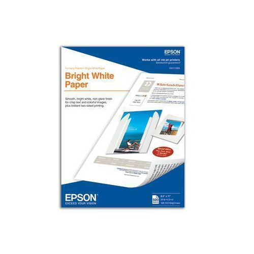 Your price for this item is $33.37
 -
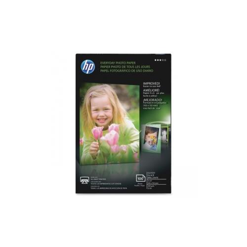 Your price for this item is $24.68
 -
 Your price for this item is $29.99
 -
 Your price for this item is $31.68
 -
 Your price for this item is $31.68
 -
 Your price for this item is $39.99
 -
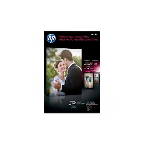 Your price for this item is $28.99
 -
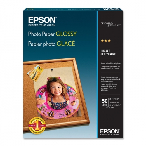 Your price for this item is $48.68
Discover more categories related to Printmaking Papers
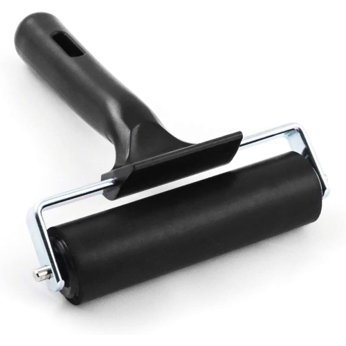
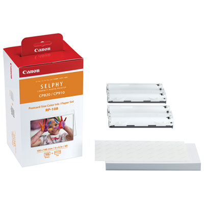
Top Collections:
Pokemon Centers, Kindle Devices, Best Budget Office Chairs, Apple iPhones 16, Best Laptops for Writers, iPhone 15 Apple, Canon G7X Cameras, Refurbished Apple Laptops, Alarm Clock, Motorola Razr Phones
Some products may be subject to Environmental Handling Fees
(EHF) depending on your province.
Learn more about EHFs.