Business Signs
Looking to make a lasting impression on your customers and stand out from the competition? Look no further than our wide selection of business signs. Whether you're in need of eye-catching outdoor signage to attract potential customers or sleek indoor signs to enhance your brand presence, we have you covered. From illuminated signs to vinyl banners, our collection offers a variety of options to suit every business need. With high-quality materials and innovative designs, our business signs are sure to make a statement and help elevate your brand to new heights. Explore our range today and take your business signage to the next level.
Sort

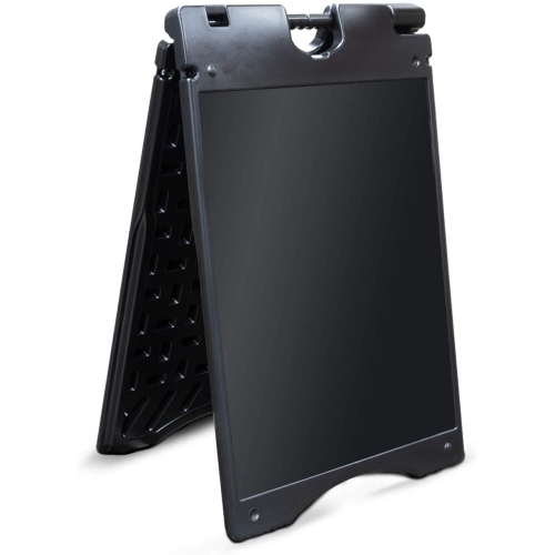







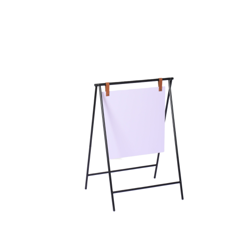


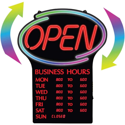
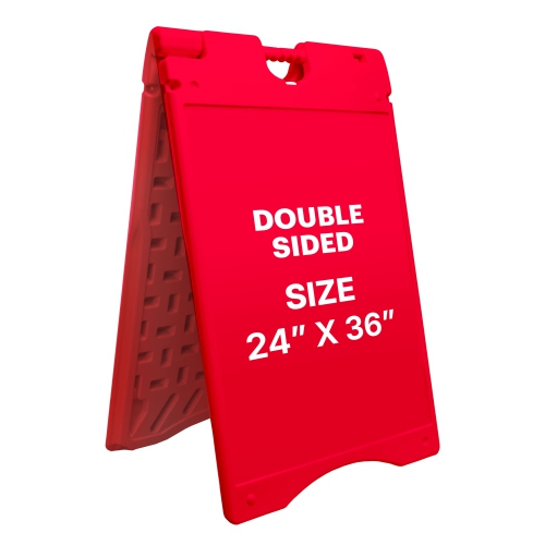
Why clear lettering matters before visitors step inside
Business signs identify a company, make an entrance easier to find, and give visitors useful information before they step inside. Their purpose can be as simple as displaying opening hours on a glass door or as prominent as carrying a business name above a busy commercial plaza. The most effective signs pair a clear message with lettering that is easy to read at the distance where people will encounter it. Bold typography, strong contrast between text and background, and generous spacing usually do more for visibility than a crowded layout filled with competing details. A pedestrian approaching a salon can read smaller information near the door, while a driver looking for a service centre needs a short, recognizable message positioned well before the entrance. Different sign formats serve these different sightlines. Pylon signs place business identification on tall, freestanding structures, helping people locate premises from farther away or distinguish tenants in a shared development. Building signs connect the business name directly to its location, giving a façade a clear point of recognition. Illuminated signs can keep names and essential messages visible after dark, provided the light is even and does not overwhelm the lettering. Near the entrance, Storefront Signs help confirm that visitors have reached the right place and can direct them towards the appropriate door, reception area, or pickup point. Retailers, cafés, professional offices, studios, clinics, and workshops all use signs, but the balance of branding and practical information varies. A quiet appointment-based office may need discreet identification and clear suite numbers; a shop on a busy street may depend on a more prominent name and an unmistakable entrance. Consistent colours, lettering, and wording across these touchpoints help a business feel organized without requiring every sign to look identical. Giving each surface one main job keeps the overall message easier to understand, whether someone is visiting for the first time or returning to a familiar location.
Materials and construction influence how business signs look, where they fit, and how well they stand up to daily use. Acrylic offers a smooth surface and crisp appearance suited to reception areas, door plaques, and displays where clean edges matter. Depending on its finish, it can also catch reflections, so the angle of nearby lighting deserves attention. Aluminum is relatively lightweight and rigid, making it useful for mounted panels that need a stable shape without excessive bulk. Composite panels can provide a flat backing for larger graphics, while flexible vinyl works well for lettering and graphics applied to compatible, smooth surfaces. Wood can add texture to a studio or hospitality space, although its finish and cleaning requirements differ from those of metal or plastic. Corrugated plastic is often used for lightweight, temporary messaging rather than permanent architectural identification. Material thickness, edge finishing, print quality, and the strength of the mounting points all contribute to durability; a substantial-looking face alone does not establish how securely a sign will perform. Fit involves more than the overall width and height. Door handles, window frames, opening doors, nearby fixtures, and the available viewing angle can limit the usable display area. A sign that fits a window may still block an important sightline or hide information behind a frame. For applied graphics, surface compatibility matters: textured walls, certain coatings, and uneven panels may not provide the contact an adhesive needs. For hanging or wall-mounted signage, the support surface and fasteners need to suit the sign’s weight and installation method. Freestanding displays need a stable base and a position that leaves accessible routes clear. Larger building, pylon, and powered signs may require professional installation, property-owner approval, and local permits. Confirming these requirements before committing to a format helps avoid a mismatch between an appealing design and what the site can accommodate. Businesses in shared premises may also need to follow an established sign layout, keeping tenant names consistent while allowing each business to remain recognizable.
Day-to-day usefulness often comes down to details that are easy to overlook in a design preview. A decorative script may suit a logo but make opening hours difficult to read; a glossy face may look polished straight on yet obscure text beneath a ceiling light. Letter size should reflect viewing distance, and important information should remain distinct from decorative elements. A simple hierarchy works well: the business name first, its purpose or destination next, and supporting details only where people have time to stop and read them. An arrow beside a clearly named destination is more helpful than an arrow alone, particularly in a building with several entrances. Where bilingual information is needed, allowing space for both languages from the outset helps preserve legibility instead of squeezing a second line into the margins. Accessibility also extends beyond large print. Clear contrast, familiar symbols, sensible placement, and tactile or Braille features where required can make a space easier to navigate for more visitors. Illuminated formats add considerations such as access to a suitable power source, cable routing, brightness, and access for maintenance. Steady, balanced lighting generally supports identification better than lighting that competes with the message. Care should follow the material and manufacturer’s instructions: a soft cloth and an approved cleaner can help protect lettering and finishes, while abrasive pads or unsuitable solvents may scratch surfaces or damage printed graphics. Edges, brackets, bases, and electrical components also benefit from routine checks appropriate to their construction. Information needs attention too. Outdated hours, a missing suite number, or an arrow pointing towards a closed entrance can undermine an otherwise well-made sign. For spaces where room assignments or operating details change, replaceable inserts and changeable message areas can keep the main display useful without redesigning everything. Permanent identification benefits from a simpler, longer-lasting layout. Whether marking a reception desk, identifying a storefront, or guiding visitors through shared premises, well-chosen business signs combine readable messaging, suitable materials, and thoughtful placement to make everyday interactions more straightforward.
Materials and construction influence how business signs look, where they fit, and how well they stand up to daily use. Acrylic offers a smooth surface and crisp appearance suited to reception areas, door plaques, and displays where clean edges matter. Depending on its finish, it can also catch reflections, so the angle of nearby lighting deserves attention. Aluminum is relatively lightweight and rigid, making it useful for mounted panels that need a stable shape without excessive bulk. Composite panels can provide a flat backing for larger graphics, while flexible vinyl works well for lettering and graphics applied to compatible, smooth surfaces. Wood can add texture to a studio or hospitality space, although its finish and cleaning requirements differ from those of metal or plastic. Corrugated plastic is often used for lightweight, temporary messaging rather than permanent architectural identification. Material thickness, edge finishing, print quality, and the strength of the mounting points all contribute to durability; a substantial-looking face alone does not establish how securely a sign will perform. Fit involves more than the overall width and height. Door handles, window frames, opening doors, nearby fixtures, and the available viewing angle can limit the usable display area. A sign that fits a window may still block an important sightline or hide information behind a frame. For applied graphics, surface compatibility matters: textured walls, certain coatings, and uneven panels may not provide the contact an adhesive needs. For hanging or wall-mounted signage, the support surface and fasteners need to suit the sign’s weight and installation method. Freestanding displays need a stable base and a position that leaves accessible routes clear. Larger building, pylon, and powered signs may require professional installation, property-owner approval, and local permits. Confirming these requirements before committing to a format helps avoid a mismatch between an appealing design and what the site can accommodate. Businesses in shared premises may also need to follow an established sign layout, keeping tenant names consistent while allowing each business to remain recognizable.
Day-to-day usefulness often comes down to details that are easy to overlook in a design preview. A decorative script may suit a logo but make opening hours difficult to read; a glossy face may look polished straight on yet obscure text beneath a ceiling light. Letter size should reflect viewing distance, and important information should remain distinct from decorative elements. A simple hierarchy works well: the business name first, its purpose or destination next, and supporting details only where people have time to stop and read them. An arrow beside a clearly named destination is more helpful than an arrow alone, particularly in a building with several entrances. Where bilingual information is needed, allowing space for both languages from the outset helps preserve legibility instead of squeezing a second line into the margins. Accessibility also extends beyond large print. Clear contrast, familiar symbols, sensible placement, and tactile or Braille features where required can make a space easier to navigate for more visitors. Illuminated formats add considerations such as access to a suitable power source, cable routing, brightness, and access for maintenance. Steady, balanced lighting generally supports identification better than lighting that competes with the message. Care should follow the material and manufacturer’s instructions: a soft cloth and an approved cleaner can help protect lettering and finishes, while abrasive pads or unsuitable solvents may scratch surfaces or damage printed graphics. Edges, brackets, bases, and electrical components also benefit from routine checks appropriate to their construction. Information needs attention too. Outdated hours, a missing suite number, or an arrow pointing towards a closed entrance can undermine an otherwise well-made sign. For spaces where room assignments or operating details change, replaceable inserts and changeable message areas can keep the main display useful without redesigning everything. Permanent identification benefits from a simpler, longer-lasting layout. Whether marking a reception desk, identifying a storefront, or guiding visitors through shared premises, well-chosen business signs combine readable messaging, suitable materials, and thoughtful placement to make everyday interactions more straightforward.
Top selling and popular products
-
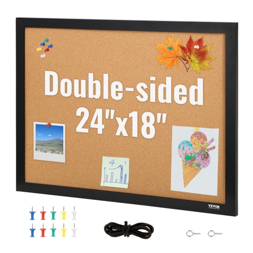 Your price for this item is $42.99
-
 Your price for this item is $28.99
-
 Your price for this item is $63.99
-
 Your price for this item is $86.99
-
 Your price for this item is $89.99
-
 Your price for this item is $149.99
-
 Your price for this item is $68.99
-
 Your price for this item is $111.99
Discover more categories related to Business Signs
Top Collections:
Pokemon Centers, Kindle Devices, Best Cameras for Sports Photography, Pokémon 30th Celebration Cards, Canon G7X Cameras, Samsung Galaxy Phones, iPhone 15 Apple, Best Black Friday Deals On Electronics, Jackery Power Stations, Solar Generators for Home
Some products may be subject to Environmental Handling Fees
(EHF) depending on your province.
Learn more about EHFs.