Indoor Signs
Transform your living space or business environment with our diverse selection of indoor signs. Whether you're looking to add a touch of personality to your home, enhance the ambiance of your office, or clearly communicate important information in a commercial setting, our collection offers something for every need and style. From decorative pieces that reflect your unique taste to functional signs that ensure clarity and direction, indoor signs are an essential element for creating inviting and efficient spaces. Discover the perfect sign to suit your space and make a statement that resonates.
Sort






















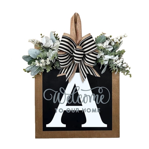


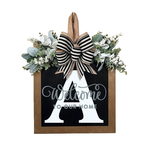
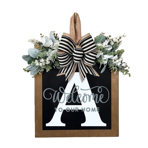
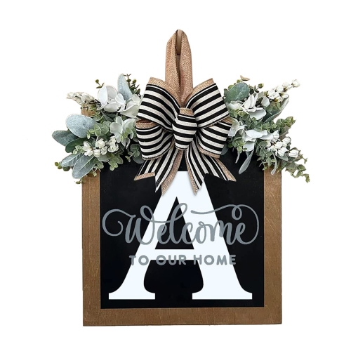

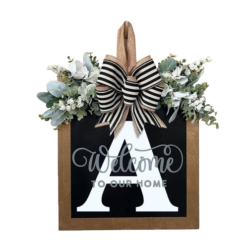
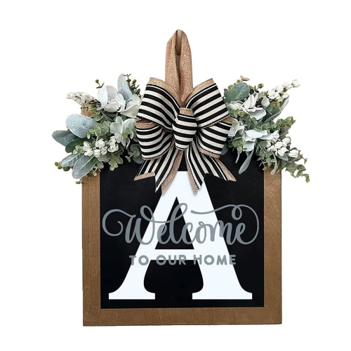
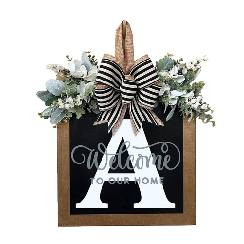

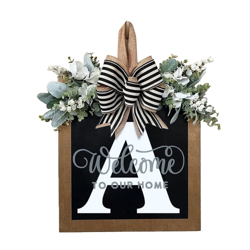






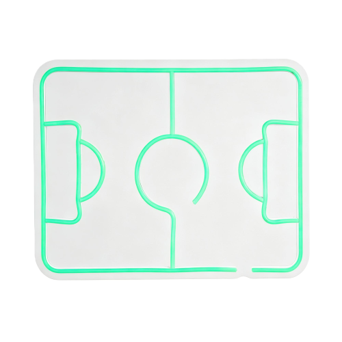






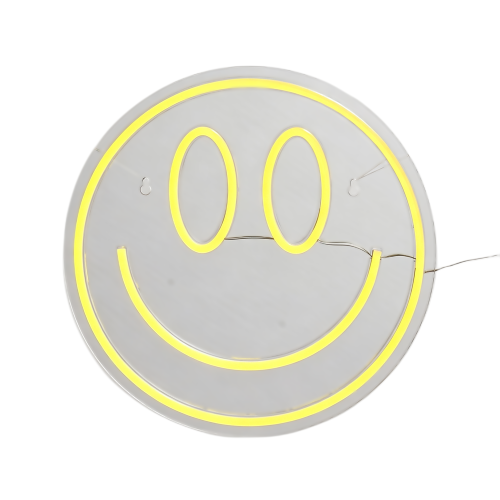
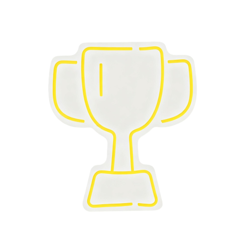











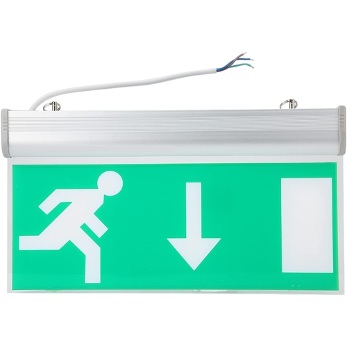
















































The right sign does more than point the way
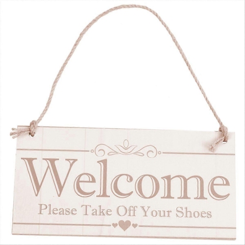
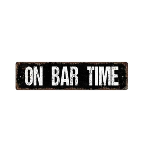
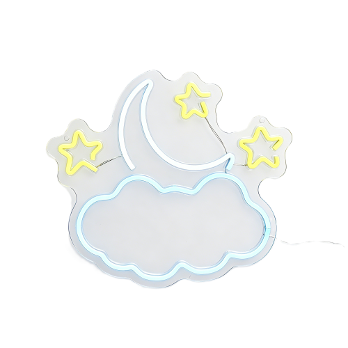
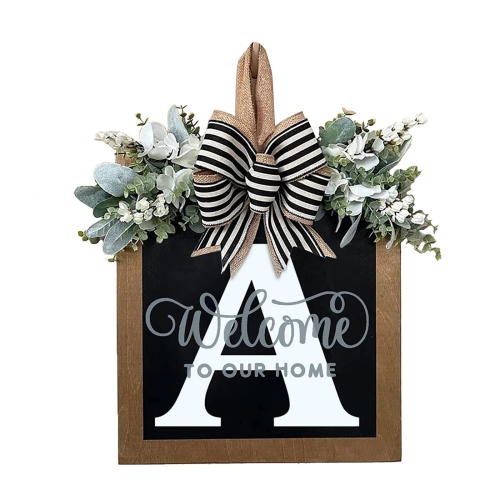
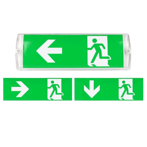
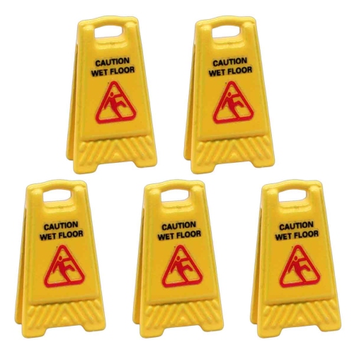
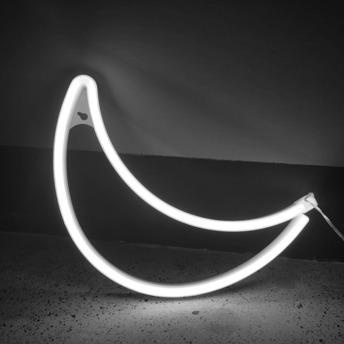
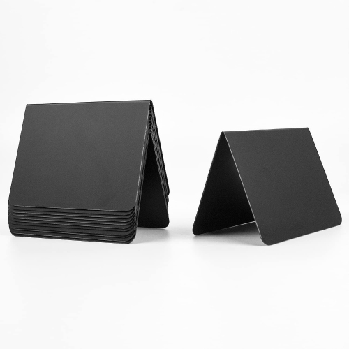
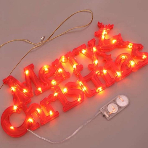
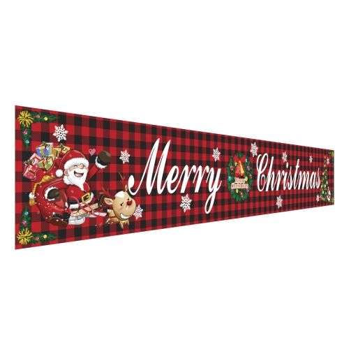
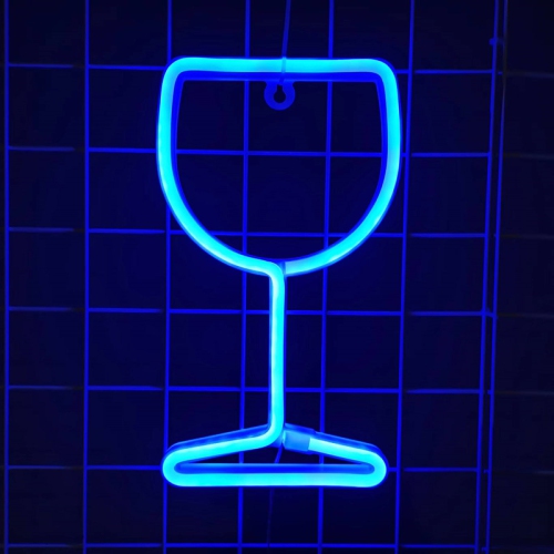
Indoor signs are visual displays used inside buildings to identify spaces, direct people, communicate information, and add character to a room. They range from simple door plaques and directional arrows to dimensional lettering, decorative wall signs, and digital displays. In a workplace, a clear reception sign establishes where visitors should check in, while matching room labels make meeting spaces easier to find. In a shop, clinic, community centre, or shared residential building, well-placed signs reduce uncertainty at entrances, corridor intersections, and other points where people need to make a decision. Their purpose often determines their appearance: a washroom sign needs to be understood quickly, a lobby sign may express a business’s identity, and a decorative sign can bring personality to a kitchen, studio, or games room. Static signs suit information that stays consistent, such as room names or directions, while changeable inserts and digital signage accommodate details that need regular updates. Raised lettering adds depth and casts subtle shadows, whereas flat printed graphics create a streamlined finish against a wall or door. Illuminated designs provide another visual effect, although brightness and placement matter in spaces where people read, work, or relax. Indoor signage works best when its message suits both the setting and the people using it. A playful phrase might feel at home in a recreation room but be distracting outside a treatment room. Equally, a discreet nameplate can look polished beside a private office yet be difficult to notice across a busy entrance. Scale, tone, and clarity all contribute to how naturally a sign belongs in its surroundings. For shared spaces, consistent symbols and naming make separate signs feel like parts of the same system rather than unrelated additions. Even a small sign can make a noticeable difference when it answers a practical need at exactly the right location, such as identifying a delivery entrance from inside a lobby or distinguishing a quiet room from an adjoining lounge.
Materials influence an indoor sign’s appearance, weight, cleaning needs, and suitability for different locations. Acrylic offers a smooth surface and can have a clear, frosted, or opaque finish, making it suitable for both understated plaques and more prominent lettering. Metal brings a crisp, structured look; brushed finishes tend to soften reflections, while polished surfaces draw more attention to nearby light sources. Wood adds visible grain and warmth, with painted, stained, and unfinished surfaces each requiring different care. Lightweight printed panels provide a broad surface for text or graphics, while flexible vinyl lettering and wall graphics sit close to the surface beneath them. These materials are not interchangeable in every setting. A sign near a sink may encounter splashes, a plaque on a frequently used door may receive repeated handling, and a large wall display needs secure support appropriate to its weight. Surface texture matters, too: lettering that adheres neatly to smooth glass may not perform the same way on textured paint, brick, or wallpaper. Fit involves more than checking whether a sign fits between a doorframe and a light switch. The viewing distance, available wall area, door movement, and surrounding fixtures all affect how comfortably it can be seen. A short room name beside a doorway calls for a different scale than an arrow intended to guide visitors from the far end of a corridor. Strong contrast between lettering and background, straightforward typefaces, and uncluttered layouts support readability. Glossy finishes can reflect overhead fixtures or nearby windows, making otherwise clear text harder to read from certain angles. Accessibility also deserves careful attention in public and shared spaces. Depending on the building and jurisdiction, applicable requirements may address tactile characters, Braille, symbols, contrast, and installation position. Decorative lettering alone does not establish compliance. Signs supporting accessible routes, room identification, or safety information need to suit their intended function and the relevant provincial, territorial, municipal, and building requirements.
Mounting and everyday upkeep play a large part in how indoor signs look and perform over time. Adhesive-backed designs offer a close-to-the-wall appearance, but their suitability depends on the adhesive, surface finish, installation conditions, and removal method. Fresh paint, delicate coatings, and uneven surfaces can complicate attachment or increase the chance of marks when a sign is removed. Screw-mounted plaques and stand-off fittings create a more permanent installation and require hardware suited to both the sign and the supporting surface. Hanging designs need enough clearance to avoid contact with opening doors or passing people, while freestanding signs need a stable position outside walking routes. In leased premises, mounting choices may also be subject to property rules. Care is usually simplest when it follows the material’s instructions: a soft cloth may be appropriate for routine dusting, while abrasive pads or unsuitable cleaners can scratch acrylic, dull a finish, or damage printed graphics. Electrical signs and digital displays have additional requirements, including a suitable power source, cable routing, ventilation, and access for maintenance. A display that looks tidy from the front should not leave cords crossing a doorway or trailing through a reception area. For businesses and shared workspaces, Office Signs can help establish a consistent approach to room labels, reception messages, and everyday directions. Matching proportions and lettering styles make information easier to recognize without requiring every sign to be identical. Interchangeable inserts can be useful where room occupants or schedules change, while fixed lettering suits permanent names and established routes. At home, decorative signs can mark a hobby space, personalize an entryway, or make a shared room feel more distinctive. Their strongest effect often comes from a thoughtful relationship with surrounding furniture, artwork, and lighting rather than sheer size. Across these settings, durable construction, legible wording, appropriate mounting, and straightforward care help indoor signage remain useful and visually balanced through daily use.
Materials influence an indoor sign’s appearance, weight, cleaning needs, and suitability for different locations. Acrylic offers a smooth surface and can have a clear, frosted, or opaque finish, making it suitable for both understated plaques and more prominent lettering. Metal brings a crisp, structured look; brushed finishes tend to soften reflections, while polished surfaces draw more attention to nearby light sources. Wood adds visible grain and warmth, with painted, stained, and unfinished surfaces each requiring different care. Lightweight printed panels provide a broad surface for text or graphics, while flexible vinyl lettering and wall graphics sit close to the surface beneath them. These materials are not interchangeable in every setting. A sign near a sink may encounter splashes, a plaque on a frequently used door may receive repeated handling, and a large wall display needs secure support appropriate to its weight. Surface texture matters, too: lettering that adheres neatly to smooth glass may not perform the same way on textured paint, brick, or wallpaper. Fit involves more than checking whether a sign fits between a doorframe and a light switch. The viewing distance, available wall area, door movement, and surrounding fixtures all affect how comfortably it can be seen. A short room name beside a doorway calls for a different scale than an arrow intended to guide visitors from the far end of a corridor. Strong contrast between lettering and background, straightforward typefaces, and uncluttered layouts support readability. Glossy finishes can reflect overhead fixtures or nearby windows, making otherwise clear text harder to read from certain angles. Accessibility also deserves careful attention in public and shared spaces. Depending on the building and jurisdiction, applicable requirements may address tactile characters, Braille, symbols, contrast, and installation position. Decorative lettering alone does not establish compliance. Signs supporting accessible routes, room identification, or safety information need to suit their intended function and the relevant provincial, territorial, municipal, and building requirements.
Mounting and everyday upkeep play a large part in how indoor signs look and perform over time. Adhesive-backed designs offer a close-to-the-wall appearance, but their suitability depends on the adhesive, surface finish, installation conditions, and removal method. Fresh paint, delicate coatings, and uneven surfaces can complicate attachment or increase the chance of marks when a sign is removed. Screw-mounted plaques and stand-off fittings create a more permanent installation and require hardware suited to both the sign and the supporting surface. Hanging designs need enough clearance to avoid contact with opening doors or passing people, while freestanding signs need a stable position outside walking routes. In leased premises, mounting choices may also be subject to property rules. Care is usually simplest when it follows the material’s instructions: a soft cloth may be appropriate for routine dusting, while abrasive pads or unsuitable cleaners can scratch acrylic, dull a finish, or damage printed graphics. Electrical signs and digital displays have additional requirements, including a suitable power source, cable routing, ventilation, and access for maintenance. A display that looks tidy from the front should not leave cords crossing a doorway or trailing through a reception area. For businesses and shared workspaces, Office Signs can help establish a consistent approach to room labels, reception messages, and everyday directions. Matching proportions and lettering styles make information easier to recognize without requiring every sign to be identical. Interchangeable inserts can be useful where room occupants or schedules change, while fixed lettering suits permanent names and established routes. At home, decorative signs can mark a hobby space, personalize an entryway, or make a shared room feel more distinctive. Their strongest effect often comes from a thoughtful relationship with surrounding furniture, artwork, and lighting rather than sheer size. Across these settings, durable construction, legible wording, appropriate mounting, and straightforward care help indoor signage remain useful and visually balanced through daily use.
Top selling and popular products
-
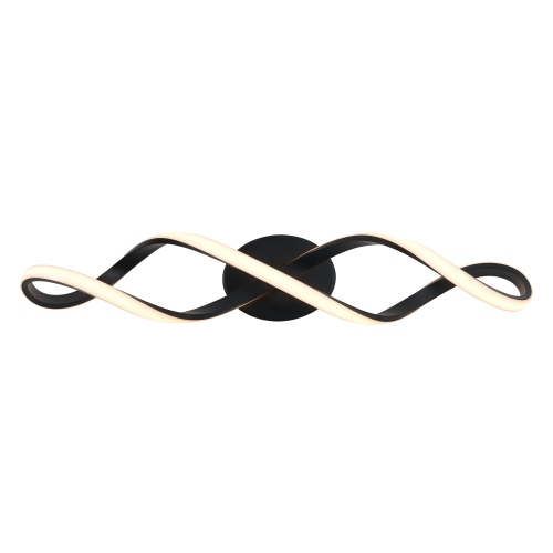 Your price for this item is $99.99
-
 Your price for this item is $298.99
-
 Your price for this item is $169.99
-
 Your price for this item is $159
-
 Your price for this item is $49.99
-
 Your price for this item is $59.99
-
 Your price for this item is $139
-
 Your price for this item is $139
Discover more categories related to Indoor Signs


Top Collections:
Pokemon Centers, Kindle Devices, Best Cameras for Sports Photography, Pokémon 30th Celebration Cards, Canon G7X Cameras, Samsung Galaxy Phones, iPhone 15 Apple, Best Black Friday Deals On Electronics, Jackery Power Stations, Solar Generators for Home
Some products may be subject to Environmental Handling Fees
(EHF) depending on your province.
Learn more about EHFs.